
http://motherjones.com/politics/2011/02/income-inequality-in-america-cha...
It's the Inequality, Stupid

Eleven charts that explain what's wrong with America.
Want more charts like these? See our charts on the secrets of the jobless recovery, the richest 1 percent of Americans, and how the superwealthy beat the IRS.
How Rich Are the Superrich?
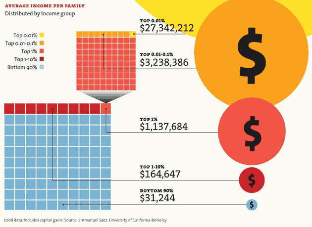
A huge share of the nation's economic growth over the past 30 years has gone to the top one-hundredth of one percent, who now make an average of $27 million per household. The average income for the bottom 90 percent of us? $31,244.

Note: The 2007 data (the most current) doesn't reflect the impact of the housing market crash. In 2007, the bottom 60% of Americans had 65% of their net worth tied up in their homes. The top 1%, in contrast, had just 10%. The housing crisis has no doubt further swelled the share of total net worth held by the superrich.
Winners Take All
The superrich have grabbed the bulk of the past three decades' gains.

Out of Balance
A Harvard business prof and a behavioral economist recently asked more than 5,000 Americans how they thought wealth is distributed in the United States. Most thought that it’s more balanced than it actually is. Asked to choose their ideal distribution of wealth, 92% picked one that was even more equitable.

Capitol Gain
Why Washington is closer to Wall Street than Main Street.
 member max. est. net worth Rep. Darrell Issa (R-Calif.) $451.1 million Rep. Jane Harman (D-Calif.) $435.4 million Rep. Vern Buchanan (R-Fla.) $366.2 million Sen. John Kerry (D-Mass.) $294.9 million Rep. Jared Polis (D-Colo.) $285.1 million Sen. Mark Warner (D-Va.) $283.1 million Sen. Herb Kohl (D-Wisc.) $231.2 million Rep. Michael McCaul (R-Texas) $201.5 million Sen. Jay Rockefeller (D-W.Va.) $136.2 million Sen. Dianne Feinstein (D-Calif.) $108.1 million combined net worth: $2.8 billion

Congressional data from 2009. Family net worth data from 2007. Sources: Center for Responsive Politics; US Census; Edward Wolff, Bard College.
Who's Winning?
For a healthy few, it's getting better all the time.


YOUR LOSS,THEIR GAIN
How much income have you given up for the top 1 percent?

WANT MORE CHARTS LIKE THESE?
See our charts on the secrets of the jobless recovery, the richest 1 percent of Americans, and how the superwealthy beat the IRS. Some samples:
YOU HAVE NOTHING TO LOSE BUT YOUR GAINS
Productivity has surged, but income and wages have stagnated for most Americans. If the median household income had kept pace with the economy since 1970, it would now be nearly $92,000, not $50,000.

MEET THE ELITE
ONLY LITTLE PEOPLE PAY TAXES

Sources
Income distribution: Emmanuel Saez (Excel)
Net worth: Edward Wolff (PDF)
Household income/income share: Congressional Budget Office
Real vs. desired distribution of wealth: Michael I. Norton and Dan Ariely (PDF)
Net worth of Americans vs. Congress: Federal Reserve (average); Center for Responsive Politics (Congress)
Your chances of being a millionaire: Calculation based on data from Wolff (PDF); US Census (household and population data)
Member of Congress' chances: Center for Responsive Politics
Wealthiest members of Congress: Center for Responsive Politics
Tax cut votes: New York Times (Senate; House)
Wall street profits, 2007-2009: New York State Comptroller (PDF)
Unemployment rate, 2007-2009: Bureau of Labor Statistics
Home equity, 2007-2009: Federal Reserve, Flow of Funds data, 1995-2004 and 2005-2009 (PDFs)
CEO vs. worker pay: Economic Policy Institute
Historic tax rates: Calculations based on data from The Tax Foundation
Federal tax revenue: Joint Committee on Taxation (PDF)
More Mother Jones charty goodness: How the rich get richer; how the poor get poorer; who owns Congress?
Do you appreciate fair and factual reporting on Occupy Wall Street? Please donate a few bucks to help us expand our coverage.
